Overview
A Token is a placed object which visually represents Actors on the game Canvas. The Token displays the Actor's position, appearance, rotation, vision configuration, status effects, and more. Each Token is specific to Scenes in which it exists.
This article will familiarize you with the various options available to the tokens, and how to manipulate them. It will also detail the difference between a prototype and placed token, and how the token wildcard system works.
Token Controls
The Token Controls panel is the default tool which is opened when loading into a scene. It is represented with a user icon ( ) on the left-hand side of the user interface. This opens the tool palette, and provides tools manipulate tokens you have control over.
Users can also place Pings on the canvas while this tool is selected.
- Select Tokens ( )
- This tool allows you to select one or more tokens on the current scene. While you can select multiple tokens, you can only manipulate tokens you have control over. For more on this see Users and Permissions.
- Select Targets ( )
- This tool allows you to target tokens on the current scene buy left-clicking on a token. This places an indicator on the token. You can shift-click multiple tokens to target additional tokens. Additionally, you can click and drag to create a bounding box which targets all tokens inside its area.
- Measure Distance ( )
- This tool functions as a ruler allowing you to measure distances between two points. You can click and drag anywhere on the canvas and a ruler showing the distance from that point to your cursor's current location will be drawn, and indicates the total distance in map grid units. Using control + click allows you to create a chained ruler with each click placing a new waypoint in the total distance measured.
If the origin point of a ruler is a token you have control over you can press space to case the token to move to the end of the ruler.
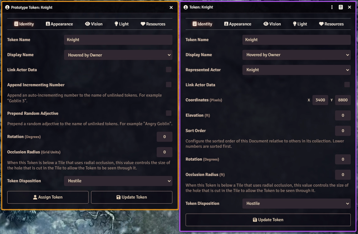
An important concept to understand when working with Tokens is the difference between a Prototype Token and a Placed Token.
Prototype Tokens
Prototype Tokens allow you to configure a 'preset' for that Actor's tokens which will be used whenever a new token is placed.
A Prototype Token stores the configuration of a Token for a particular Actor before that Token has been placed onto the game canvas. The prototype defines the default setup that a newly created Token starts with. To configure the Prototype Token for an Actor, open the Actor Sheet and click the Prototype Token button in the top bar.
Placed Tokens
Once a Token is placed, it becomes its own independent copy of the prototype. For example - a Prototype Token for a player character could be configured to have a certain vision distance - but when that Token is placed into a Scene that has different lighting conditions, the placed copy of the Token could be changed to increase or decrease visibility for that scene. To configure a placed Token, right click on the Token to display the Token HUD and click the gear icon to open that Token's configuration sheet, or double right-click the token.
Token Configuration Options
If you have granted your players permission to modify their own token settings, the preview of changes to Vision settings may reveal more of the scene canvas than you wish. This permission is disabled by default, allowing only trusted players and higher to configure token settings.
The Token Configuration sheet features a large number of options spread out across five different tabs, each tab allowing you to modify certain aspects of the token.
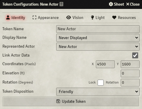
The Identity tab controls what actor data is associated with the token and what others can see of that identifying information. This includes the actor's name, image, and more.
- Token Name
- This determines the name which is shown for the token. When a new actor is created this defaults to whatever name that actor was given, but it can be changed to be different from the name.
- Display Name
Configure the level of visibility for the token's nameplate.
- Never Displayed - The nameplate is not displayed at all.
- When Controlled - The nameplate is displayed when the Token is currently controlled
- Hovered by Owner - The nameplate is displayed when the token is hovered over by a User who owns the token's Actor
- Hovered by Anyone - The nameplate is displayed when the token is hovered over by any User
- Always for Owner - The nameplate is displayed at all times to any User who owns the token's Actor
- Always for Everyone - The nameplate is displayed at all times to every User
- Represented Actor
- Specify which Actor from the Actors Sidebar tab defines the data which should be used by the Token. The dropdown list of options is drawn from the available actors in the game world.
- Link Actor Data
- When enabled, changes to the resource pools either on the base Actor or on the Token itself will reflect in the other location. These changes apply to all linked tokens in all scenes, and is best used for unique or named characters. It's not recommended to link actor data for generic creatures or types of character (such as bandits). When data is not linked, each Token will have independent resources pools and turn order tracking.
- Coordinates (Pixels)
- (Placed Tokens Only) The current horizontal X position and vertical Y position of the Token in a Scene. Directly editing these fields on a token placed in a scene will change the token's position, these fields are automatically set when the token is placed into a scene or moved during play.
- Elevation (Distance)
- The Token's current elevation in grid units distance which is displayed visually above the Token. This is used to indicate whether certain Tokens are flying or burrowing at an altitude that differs from what is standard for the Scene. Editing this on a prototype token has no effect, as the token starts at 0 elevation when placed into a scene. An elevation below 0 will place the token below the background of the scene, useful for indicating that a token is burrowed.
- Rotation (Degrees)
- The Token's current direction of facing in degrees. Rotation of zero (the default) corresponds to a southward facing as this is the most commonly used convention for Token artwork. Editing this field on a prototype token determines the default rotation in degrees when it's placed into a scene. Tokens in a scene can also be rotated by holding down Shift and using the W-A-S-D keys, the arrow keys, or the mouse wheel. You can also hold down Control when using the mouse wheel to get smaller increments of rotation to more finely control a token's orientation.
- Lock Rotation
- If this setting is enabled the token cannot be rotated. This setting is ideal for portrait style tokens where the artwork orientation is fixed and not expected to change.
- Token Disposition
- Sets the color of the border shown around a Token when it's selected or hovered over with a mouse cursor. Disposition is used to differentiate enemies from allies during combat encounters. Neutral tokens have yellow borders, friendly tokens have teal borders, and hostile tokens have red borders.
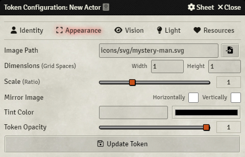
The Appearance tab controls both the art a token uses to represent its actor, as well as how that art is displayed for users, such as dimensions, scale, and tint..
- Image Path
- The file path to the artwork that is used for the Token. This file must be in the
$UserData/Data/directory or a publicly accessible web location. - Randomize Wildcard Images (Prototype Tokens Only)
- If checked, the provided Token Image Path is treated as a wildcard pattern that is matched against multiple existing files. When a wildcard Token is configured, each time that Token is placed an image is randomly chosen from the matching set. Note that this can only be configured on prototype tokens. Once a token is placed in a scene the image used is set, it must then be changed manually by editing the in-scene token. For a more detailed explanation of this feature, see the dedicated section later in this article. Please see below for more information on using image wildcards.
- Alternate Actor Tokens (Placed Wildcard Tokens Only)
- If Randomize Wildcard Images is checked on a prototype token, this dropdown list appears in the token config window for the placed actor. This list provides all available images which matched the wildcard you entered and allows you to quickly select a specific image you want to use for that actor.
- Dimensions (Grid Units)
- The number of grid units this token occupies. A token which uses a single grid square would have a width and height of 1.
- Scale (Ratio)
- A scaling ratio for the size of the Token's artwork. The token base size in grid units is unaffected by this value, but the visual size of the artwork is relative to that size and will change with scale. Numbers greater than 1 result in larger token artwork while numbers less than 1 result in smaller token artwork.
- Mirror Image
- This option provides two check boxes which determine if the token artwork is flipped horizontally or vertically, based on which boxes are checked.
- Tint Color
- This applies a hex color tint to the token's artwork as an overlay, and can either be entered directly or chosen using a color picker.
- Token Opacity
- This sets the opacity of the token's artwork. This can be used to make a token semi-transparent, or to make it completely invisible. This is useful for tokens which might be sneaking, but which you still wish the players to be able to see.
Wildcard Token Images
Wildcard tokens provide a way for GMs to manage use of a single actor representing a diverse group of characters that all have the same attributes, or which do not necessarily require a fully linked actor sheet. To configure Wildcard Tokens, access the token configuration menu and on the appearance tab, tick the Randomize Wildcard Images toggle. Then configure the image path to use wildcards.
The path to the folder containing the images you wish to have the token draw from. This should be set to something such as: /your/path/here/* for all images in the folder or /your/path/here/*.png for all files of the .png format in the folder.
This can also include case sensitive options such as /your/path/here/Goblin* for all images that start with the word "Goblin," it can also include a selection list, for specified options using /your/path/here/{Goblin_1,Goblin_2}.png to choose only between the Goblin_1.png or Goblin_2.png when the actor is placed into a scene.
This can be combined with the asterisk as detailed above to further randomize how Foundry VTT selects tokens.
After placing a token that has the Randomize Wildcard Image option set, you can change the token from a convenient list of other tokens in that folder. To do so, right click the token you wish to change and on the image tab simply select a different image from the Alternate Actor Tokens selection menu.
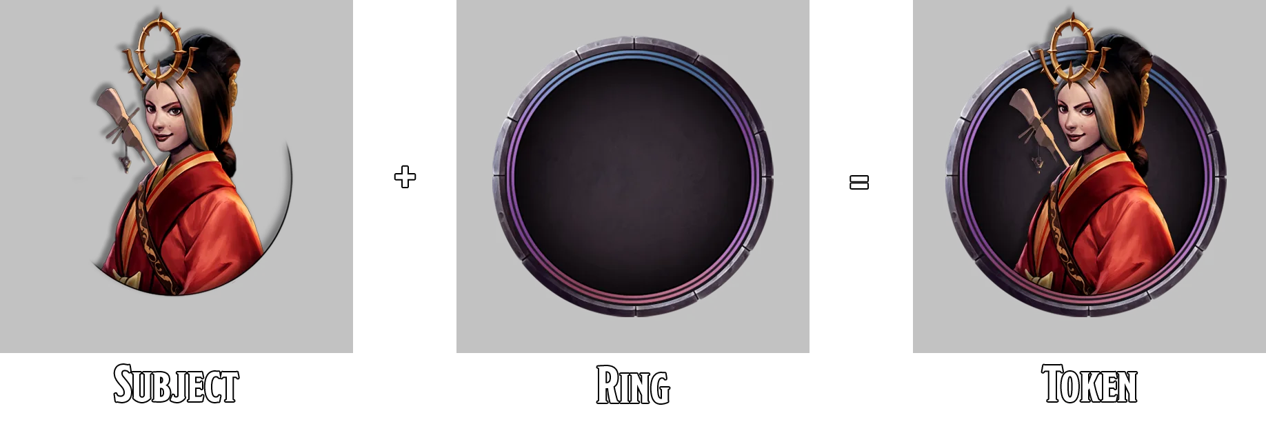
Dynamic Token Rings
Foundry can automatically add circular rings around Token art, easily turning ordinary pieces of art into "pog"-style circular tokens.
For more information about Dynamic Token Rings, please see Dynamic Token Rings.
The Vision Tab
Token Vision is one of the most notable features of Foundry VTT, and is detailed more thoroughly below.
The Lighting Tab
This tab is broken down into three sub-tabs which determine the appearance and reach of the token's light emission. The settings here are identical to those found in the ambient lighting tools, please refer to Lighting for an in-depth explanation of the various options available.
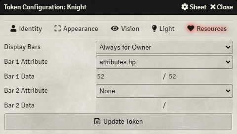
- Display Bars
Configure the level of visibility for the token's resource bars. The following options are supported:
Never Displayed - Resource bars will not be shown
When Controlled - Resource bars are displayed when the Token is currently controlled.
Hovered by Owner - Resource bars are displayed to any User that owns the token's Actor when they hover their cursor over the token.
Hovered by Anyone - Resource bars are displayed to any User that overs their cursor over the token.
Always for Owner - Resource bars are displayed at all times, and visible to the Actor's owner.
Always for Everyone - Resource bars are displayed at all times, and visible to all Users.
- Bar 1 Attribute
- Select the attribute from the Actor's available data fields which should be displayed using the Token's primary resource bar.
- Bar 1 Data
- These fields are displayed for reference purposes only - you cannot configure the value of resource bars within the Token configuration as those are controlled by the Actor which the Token represents.
- Bar 2 Attribute
- Select the attribute from the Actor's available data fields which should be displayed using the Token's secondary resource bar.
- Bar 2 Data
- These fields are displayed for reference purposes only - you cannot configure the value of resource bars within the Token configuration as those are controlled by the Actor which the Token represents.
Token Vision
The most commonly used feature of Tokens is the ability to allow players to explore and experience a scene while only being able to see what their token should be able to perceive. Tokens support a variety of vision configuration options which which define how it can see a scene within the game world.
If a token does not have Vision enabled, but a Scene has been configured to require Token Vision (required by default), users who only have access to that Token will receive a warning that they do not control any tokens with ability to see the scene.
Tokens with Shared Vision: If a User has permission to control more than one token with vision, when no Token is controlled, the vision displayed will be the union of vision across all Tokens. If a User has a single Token controlled, their vision will be only what is visible to that one Token, and any other tokens will have their vision hidden.
How Vision Works
When a token is placed on a scene, it will automatically be assigned a vision configuration based on the Vision Mode and Detection Modes that it has. Vision Modes control the appearance of of a token's vision, while Detection Modes determine the mechanics of what a token can see. By default, a token which has Vision Enabled can only see based on existing light sources and will not be able to detect the presence of any other tokens which are not already illuminated in some way.
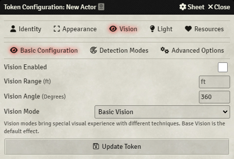
In order to understand how Vision and Detection Modes affect what a Token can see, it is important to first understand what the settings on the Vision tab of the Token Configuration mean. The Vision tab is broken down into three sections:
- Basic Configuration - Controls how a token should see in a Scene.
- Detection Modes - Control what a Token should be able to detect in a Scene. Detection Modes like Basic Sight, Feel Tremor, See Invisibility and more.
- Advanced Options - Provide options for making fine-tuning tweaks to the appearance of a Token's vision.
The Basic Configuration tab can be used to configure facets of how a Token views the canvas and its surroundings.
- Basic Vision - The standard, default vision mode appearance which does not alter a token's vision.
- Darkvision - In areas where no light source exists, the token's vision is desaturated and does not display color. Areas which contain light sources show colors as expected.
- Monochromatic - Regardless of light source, this token will not be able to see colors.
- Tremorsense - A visual effect similar to a radar sweep, which pulses and visually obscures the scene's background but preserves details such as fog exploration and wall placement.
- Light Amplification - A visual effect similar to night-vision goggles. Light sources within range are amplified in their brightness, and areas within darkness are visibly raised. By default, this vision mode is colored green but its color can be changed via the Advanced Options subtab.
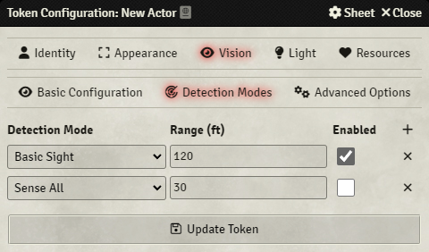
The detection modes tab controls what a Token should be able to detect in a Scene. Each Token can have have multiple Detection Modes like Basic Sight, Feel Tremor, See Invisibility and more. A Detection Mode can be added by pressing the + in the top-right of the tab.
- Detection Mode
- The Detection Mode that you want to configure. The Basic Sight detection mode defaults to match your token's configured vision range, and if not reconfigured will always show other tokens whenever they are illuminated in some way, whether that be from light sources or as a result of the configured token's vision range. Detection modes which "See" require line of sight and will not detect tokens through walls, while detection modes which "sense" ignore the presence of walls.
- Range
- The distance a Token should be able to Detect other tokens within the Scene.
- Enabled
- Whether this Detection Mode should currently be active and applied to the token's vision polygon.
There are a few different types of detection mode supported by default:
- Basic Sight - Used to override the default basic sight settings.
- See Invisibility - Depends upon line of sight and will not reveal tokens through walls. Allows a token to see other tokens that have been set with the "Invisible" condition.
- Sense Invisibility - Does not depend on line of sight and will reveal tokens through walls. Allows the token to see other tokens that have been set with the "Invisible" condition.
- Feel Tremor - allows the token to sense all other tokens at their elevation. Tokens which have an elevation greater than the scene's height are presumed to be floating or flying and will not appear on this token's vision.
- See All - Depends upon line of sight and will not reveal tokens through walls. Allows the token can see all other tokens regardless of available light.
- Sense All - Does not depend on line of sight and will reveal tokens through walls. Allows the token to see all other tokens regardless of available light.
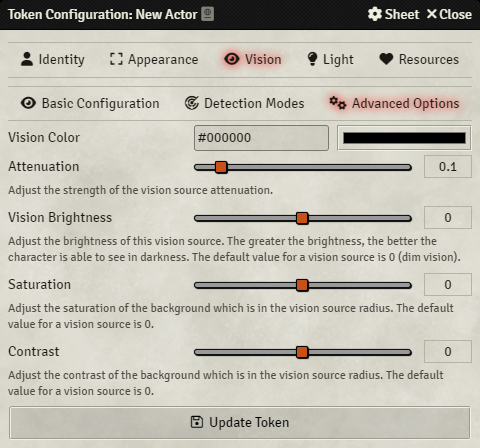
The Advanced Options subtab provide a few options which allow you to tweak how a token's vision should appear for users of that token. Note that changing a Vision Mode will overwrite these settings with preset configurations for their values. For example: changing the Sight Mode to Darkvision will always overwrite the attenuation and saturation values to 0.
- Vision Color
- A color that should be applied as a tint to this token's vision.
- Attenuation
- How gradually the Vision Mode's visual effect should fade. A higher value fades the edges of the token's vision more drastically.
- Vision Brightness
- Controls the level of brightness a sight mode applies to a token's vision, good for situations where a token represents a character who might be used to living underground experiencing the daylight for the first time, or a character who has experienced some damage to their ability to see.
- Saturation
- How much color is present in a token's vision, lower values become monochrome, while higher values become more vivid and provide more vibrant colors.
- Contrast
- How sharply colors contrast against one another. Low contrast values add a somewhat foggy appearance to all colors and their blending, while higher values make colors stand out more sharply compared to one another.
The Token HUD
Once an actor has been placed onto the canvas as a token, a number of quick actions become available through the Token Head-Up Display that can be viewed by right clicking on a token at any time.
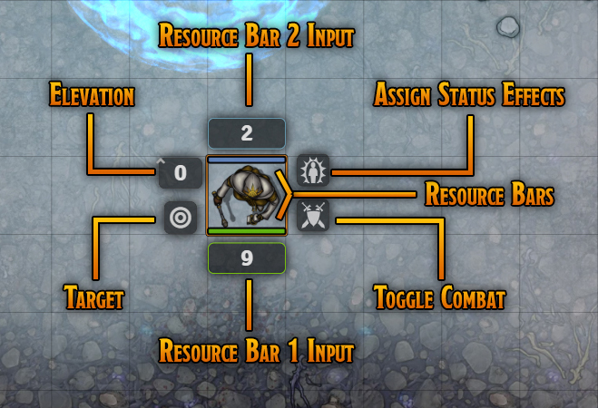
The Token Action Hud provides quick access to the following options:
- Resource Bars
- If configured via the resource table, these bars provide a visual representation of resource attributes. The system will govern what resources can be tracked and modified.
- Resource Bar Inputs
- Are used to change the value of the displayed resource bars. Clicking on the input and then adding a positive or negative number allows you to quickly increase or decrease the number presented.
- Status Effects
- This allows you to assign status effects to the token, which appear as small icons overlaid on the token art in the upper left corner. The specific art of the status effects are defined by whichever Game System is currently in use. Right clicking an icon creates a large overlay that covers the majority of the token. Tokens can only have one large overlay at a time.
- Elevation
- This provides a simple height indicator label that will appear above a token to indicate their current elevation in the measurement that the map is configured to use. This does not affect token vision at this time. Using positive and negative numbers in this field allows a user to quickly adjust the number instead of directly editing the elevation number.
- Target
- This allows a user to toggle a targeting indicator on the token.
- Toggle Combat
- If there is an active combat, clicking this button will place the token in the combat tracker. Clicking it a second time will remove the token from combat. When this is done, the token's initiative score (if it had one) is not retained.
API References
To interact with Tokens programmatically, consider using the following API concepts:
- The Token Object
- The TokenLayer Canvas Layer
- The TokenConfig Application
- The TokenHUD Interface
Additionally, the wildcard system for token images utilizes the minimatch library.