Overview
Scenes represent the areas of a World that the players may explore. Scenes may depict a variety of settings ranging from world or regional maps all the way down to small buildings or dungeons. At each point in time, one Scene is classified as the active scene. The same scene is active for all users. For each individual user a different Scene may be treated as the viewed scene, which is the area currently rendered on the game canvas for that user.
Scenes Directory
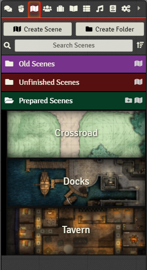
Scenes are created and managed from the Scene Directory sidebar.
Sidebar Elements
- Create Scene ( )
- This button creates a new scene with the name given. If you do not name the scene will be automatically named "New Scene" with a number appended to it.
- Create Folder ( )
- This creates a new folder. For details on how to create and use them please see the Folders article.
- Search Scenes ( )
- This searches for and lists any scenes whose names match the given string of text entered into the search bar.
- Collapse All Folders ( )
- This collapses all folders, showing only the top-level folders and any scenes not sorted into a folder.
Creating New Scenes
To create a new scene, click the Create Scene button in the Scene Directory sidebar. This will create a dialog box prompting you to name your scene. Once you have named your scene click Create New Scene. This will add your scene to the directory sidebar, and open the configuration window for you to edit and fill out.
Once you are done editing your scene click "Save Changes" to make them final. All created scenes can be found in the Scenes Directory and can edited, viewed or activated as needed.
To edit a scene after you've created it, navigate to the Scenes Directory and click on the name of the scene you want to edit, this will reopen the configuration window directly.
You can also edit an existing scene by right-clicking on the scene and selecting the Configure option. This context menu is accessible from either in the top navigation bar or in the sidebar on the right. For more on the right-click context menu options, see the section below.
When a new World is first created, the Scenes Directory will initially be empty. Though scenes can be created fairly quickly from scratch, it may be desirable to import scenes from pre-configured sources. This can be done in one of two ways: by importing scenes from a compendium pack, or by importing scenes data directly from an external JSON file.
Importing from Compendium
A scene can be imported from a compendium by either dragging the scenes from the compendium into the Scenes Directory, or by right-clicking the scene in the compendium and selecting "Import." For more information on compendia and how to use them, see the Compendium Packs article.
Importing from JSON files
If you have exported scenes that you would like to bring into a game world you can do so by loading the scene info directly from a JSON file. This can be accomplished by right-clicking any scene in the Directory and selecting "Import Data." This will open a file browser that allows you to select the desired JSON file to import. Once selected the JSON file's data overwrite the existing scene you imported the data into.
You can export an scene's data by right-clicking a scene in the Directory and selecting the "Export Data" option. This will prompt you to save a JSON file with the scene data in it.
Resizing an Existing Scene
Sometimes, when setting your scene up with all the lights, walls, tokens and other effects you wish to add, you realise that you would like the map to be more detailed and larger. When you add a higher resolution background image to your scene, you can update the image dimensions to increase the displayed resolution for your players.
For your convenience, Foundry Virtual Tabletop will attempt to reposition all tokens, tiles, lights, walls, measured templates, ambient sounds, drawings, or any other canvas placeables when the scene dimensions change. Please note that if you make very drastic changes in sizes, you may need to reposition a few placed objects.
Scene Configuration
The Scene configuration menu allows you to customize the structure and appearance of each area within your world. This configuration is displayed automatically when a new Scene is created, but can always be accessed by left-clicking on the Scene in the sidebar directory, or by right clicking on the Scene in the top navigation bar and selecting Configure.
The scene configuration menu is broken up into four sections: Basic settings, Grid settings, Lighting settings, and Ambience settings.
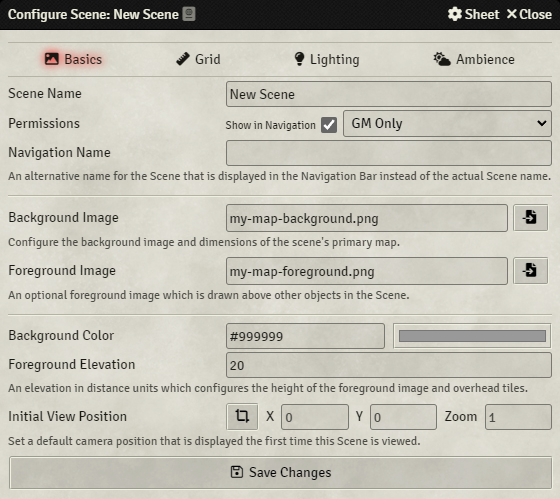
The Basic setting tab contains all of the most commonly used and fundamental settings for how a scene is configured.
- Scene Name
- The title of the scene that will appear in the Scenes directory in the sidebar and in the Scene navigation bar at the top of the screen.
- Permissions
- Scenes may be kept as "GM Only" in which case players will not be able to access them unless a Gamemaster user activates the scene or uses the 'pull to scene' function on a player. If accessibility is set to All Players, then players may choose to view the scene themselves if it is available in the navigation bar.
The Toggle Navigation feature when turned on will ensure that the scene will appear in the Navigation bar at the top of the screen. When toggled off the scene will not be shown in the Navigation bar. Scenes in the Navigation bar can be quickly hidden by right-clicking their name and clicking the "toggle navigation" option. This can only be done on scenes that are not currently active.
- Navigation Name
- This is an alternate name you can set which shows in the Navigation bar when the scene appears there. This can be different from the scene name which appears in the scene directory.
- Background Image
- The file path or web address of the background image you wish to use for your scene. The icon to the right of the field will open a File Picker that helps you to locate images within your public directory. This image determine's the scene's dimensions, though that can be changed in another tab. The icon beside the filepath field ( ) opens the file picker, allowing you to select a file available to foundry, or upload a new one.
- Foreground Image
- The file path or web address of the foreground image you wish to use for your scene. The image must be the same size as the background, and will be resized to fit automatically if it's not. This image appears overtop the scene as a whole similar to an overhead tile with no occlusion. You can read more about foreground layers in the Canvas Layers article. The icon beside the filepath field ( ) opens the file picker, allowing you to select a file available to foundry, or upload a new one.
- Background Color (#999999)
- This allows you to set the color of the background behind the scene. You can supply a color hex code or use the color picker to set the color. All newly created scenes start with a medium gray color of #999999.
- Foreground Elevation
- This sets an elevation in distance units which is used to determine the height of the foreground image and any overhead tiles in the scene. Actor tokens will be considered above these elements of the scene if their token height surpasses the numbered entered.
- Initial View Position
- This allows you to set the coordinates of an initial camera position which all users will see when the scene is first activated. Users who have a token in the Scene will instead begin their view centered on their Token location. You can use the crop icon ( ) to automatically capture your current view of the scene as the new Initial View Position, which will overwrite any previous setting there.
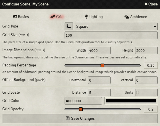
This configuration section is used to modify the grid type and alignment which is displayed as an overlay atop the Scene. Even if you are using a map that has a pre-drawn grid it is important to configure this section because the Foundry grid dictates the positions where Tokens are placed, how distance is measured, or how Measured Templates identify target spaces.
- Grid Type
- This dropdown list allows you to select one of the available grid types in the software. All newly created scenes default to square grids, but additional choices include Gridless, and Hexagonal in different orientation styles. The grid types are detailed below this list. You can also use the icon to the left of the grid type dropdown ( ) to open the Grid Configuration Tool, which allows for the fine tuning of various grid options found in this list in real time.
- Grid Size (pixels)
- The number of pixels which represent a single grid space. Foundry's default is 100 pixel squares, and has a minimum of 50px squares. Most maps use grid sizes of 70, 100, 140, or 200 pixels per square.
Note: Changing the grid size of a map may change the alignment of walls, lights, notes, and tiles. It is recommended you decide on grid size and set it before you begin adding details to the scene to avoid having to do additional work.
- Image Dimensions (pixels)
This allows you to set the the rendered width and height of your scene in pixels. The application will figure out both automatically when you select a new scene background image, but you can override these dimensions using the fields provided. The link button maintains the aspect ratio of your background image.
If you want to undo your changes to a scene's dimensions, simply clear both fields manually and save the scene, the application will automatically detect the dimensions and reset them to match the image.
- Padding Percentage
- This determines the size of the border region around the background image based on a percentage of the total scene dimensions. This padding space treats everything as unlit and hidden unless lights and an actor token with vision is in that padding area. The padding otherwise functions as normal map space and is intended to be used for staging tokens and tiles waiting to see use, or as extra side-rooms or hidden spaces.
Note: When editing a scene's padding after a scene is created Foundry will attempt to keep placed tokens and tiles in the padding space if its area is reduced, but the change in overall scene dimension will displace walls, lights, tokens, tiles, and notes. It is advised that you not change a scene's padding once you begin detailing a scene unless you're willing to rework any out of place assets.
- Offset Background (pixels, X & Y)
- These fields allow you to shift the background image horizontally or vertically by a number of pixels to better line up pre-drawn grid lines. Positive numbers shift the image to the right or down, negative numbers shift the image to the left or up.
- Grid Scale
- This determines the unit of measure that each square of space represents in this map. For battle maps this may be on the order of feet or meters, for a large region map each individual grid space could represent miles or kilometers. You may put whatever string value you wish in this field, it is only used for tooltip displays when measuring. All newly created maps will default to whatever grid scale the system determines.
- Grid Color (#000000)
- This allows you to set the color of the grid that is projected over the scene. You can supply a color hex code or use the color picker to set the color. All newly created scenes start with a black color of #000000.
- Grid Opacity
- This allows you to customize the transparency of the grid. Higher opacity results in a less transparent grid, and vice versa. If you set this slider all the way to zero (left) the grid will not be visible at all. All newly created scenes begin with a Grid Opacity of 0.2 by default.
Grid Types
Foundry Virtual Tabletop supports multiple grid types which can be configured on a per-Scene basis. The following options are supported:
- Gridless - No fixed grid is used on this Scene allowing free-form point-to-point measurement without grid lines.
- Square - A square grid is used with width and height of each grid space equal to the chosen grid size.
- Hexagonal Columns, Odd - A column-wise hexagon grid (flat-topped) where odd-numbered rows are offset.
- Hexagonal Columns, Even - A column-wise hexagon grid (flat-topped) where even-numbered rows are offset.
- Hexagonal Rows, Odd - A row-wise hexagon grid (pointy-topped) where odd-numbered columns are offset.
- Hexagonal Rows, Even - A row-wise hexagon grid (pointy-topped) where even-numbered columns are offset.
Understanding Foundry Grids
Configuration of the Grid in Foundry uses three key concepts:
- The width (in pixels) of the image.
- The height (in pixels) of the image.
- The grid size (in pixels); the number of pixels which represent a single grid space.
Foundry Virtual Tabletop enforces a minimum grid size of 50px. If your map uses a grid size lower than 50px you can still use it by increasing the background size. The easiest solution is to multiply all 3 of the width, height, and grid size by two to double every dimension.
If your background image has a visible grid already incorporated into the image and you are having trouble aligning the Foundry grid with the pre-existing one, be sure to use the Grid Alignment Tool by clicking the angled-ruler icon to the right of the Grid Type dropdown which has a specialized tool and workflow to assist with this process.
Determining Existing Grid Sizes in Images
As not all pre-gridded maps may include their grid scale and will require you to guess or otherwise determine their intended grid scale. It is possible to get a fairly accurate grids scale by examining the dimensions of the intended background image and counting the number of grid spaces and dividing the width and height by the number of vertical and horizontal squares present. For example, a map with a pre-drawn square grid which has 22 grid spaces in width and 18 grid spaces in height with dimensions of 3080px by 2520px will have an intended grid size for this map is 140px per square.
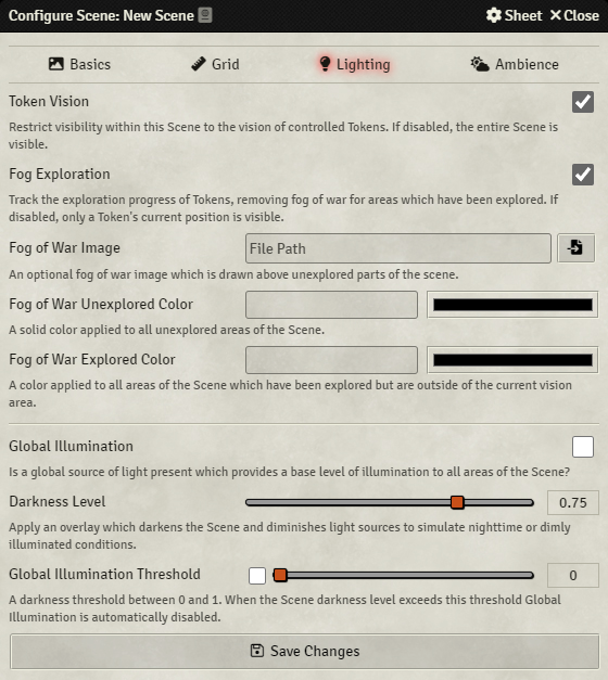
- Token Vision
- If this setting is enabled, visibility of the scene will require ownership of a Token which is placed in the scene and has a vision setting. If this setting is disabled, players will be able to see a scene even if they do not have a token present.
- Fog Exploration
- If this setting is enabled, fog-of-war exploration will be tracked on a per-User basis and stored to the database as the Scene is explored. If this setting is disabled, fog exploration does not occur and instead Tokens are limited to only what they can currently see.
- Fog of War Image
- Determines what image should be drawn in the areas of a scene that have not been explored.
- Fog of War Unexplored Color
- Set a solid color which is added as a tint to parts of the maps which are unexplored.
- Fog of War Explored Color
- Set a solid color which is added as a tint to parts of the maps which have been explored. Sections of the scene being actively viewed by a token are not tinted for that token but instead appear normally.
- Global Illumination
- If this setting is enabled, tokens with vision toggled on will be able to see everything within their line-of-sight as thought it were brightly lit. If the setting is disabled, tokens with vision will have what they can see restricted to only locations that are lit by a light source of some kind. In both cases walls will continue to obstruct vision as expected. This setting will have no effect if Token Vision is disabled for the scene or if the token does not have vision toggled.
- Darkness Level
- This controls a day/night transition for the Scene where a darkness level of zero corresponds to full daylight and a darkness level of one corresponds to the strongest level of darkness. This also applies a blue color grade to the scene to simulate the color shift present at night. Note that setting a Darkness Level has no effect on GLobal Illumination if it is toggled on.
- Global Illumination Threshold
- When this option it toggled on the slider determines the darkness level required for Foundry to automatically disable Global Illumination (see above). When the darkness level meets or exceeds the value set global illumination will be automatically disable, and reenable if the darkness level falls below the threshold.
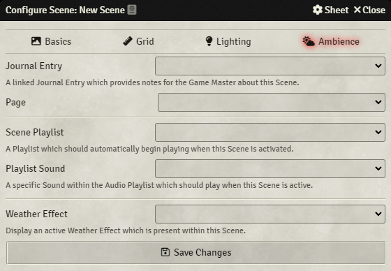
- Journal Entry
- An existing Journal which is linked to this Scene as a set of notes which can be conveniently accessed through the context menu from the navigation or sidebar.
- Journal Page
- If a journal has been selected for the scene, this dropdown list will let you select a specific page from that journal.
- Scene Playlist
- With the dropdown menu you can select one of your world's Playlists which will begin automatically playing when this Scene is activated.
- Playlist Sound
- If a playlist has been selected for the scene, this dropdown list will let you select a specific sound from that playlist which will start playback when this scene is activated.
- Weather Effect
- Define an available ambient weather effect which should be applied to this Scene.
Scenes which are displayed in the Navigation bar will appear at the top of the screen. The navigation bar is intended to act similarly to "bookmarks" for commonly used Scenes which are expected to be used during the game session. You may have many more Scenes in your World than you wish to keep in the Navigation bar at any given time. Remember that players can access Scenes in the navigation bar also if they are not set to GM Only.
Navigation Bar Context Menu
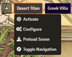
- Activate ( )
- Set a Scene as active, immediately loading and pulling all Users to the Scene.
- Configure ( )
- Open the Scene Configuration sheet.
- Preload Scene (
- Request that all connected Users begin loading the image and video assets needed to display this Scene in the background.
- Toggle Navigation ( )
- Remove the Scene from the Navigation bar if it is not active.
Scenes Sidebar Context Menu
All Scenes, including those not displayed in the Navigation Bar, are available in the Scenes sidebar directory which is denoted by a tri-fold map icon ( ). Each Scene in the sidebar has additional context menu options available.
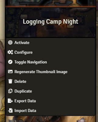
- View Scene ( )
- Loads the scene only for you, without activating it and pulling users to it.
- Activate ( )
- Set a Scene as active, adding it to the Navigation Bar and immediately loading and pulling all Users to the Scene.
- Configure ( )
- Open the Scene Configuration sheet.
- Toggle Navigation ( )
- Add or remove the Scene from the Navigation bar if it is not active.
- Regenerate Thumbnail Image ( )
- Rebuild a thumbnail image for the Scene background which is displayed as a preview in the Sidebar.
- Delete ( )
- Deletes the item, after accepting a confirmation prompt.
- Duplicate ( )
- Creates a copy of the item in the directory.
- Export Data ( )
- Exports the item's data as a JSON file on your computer.
- Import Data ( )
- Imports data into the right-clicked item from a JSON file on your computer.
API References
To interact with Scenes programmatically, you will primarily use the following API concepts: