Foundry VTT maintains a standard for content packs that it endorses. This document contains guidelines to help content creators work toward that quality standard to make sure that all content endorsed by Foundry VTT is released as the best version of itself. It also contains techniques and best practices to leverage FVTT's rendering engine, maximize performance, ensure compatibility and minimize errors for users.
Useful Articles
The Media Optimization Guide will guide you through ideal file naming, asset organization, and preferred file formats for art and audio.
The Content Packaging Guide will guide you through the steps necessary to pack up a module with content for distribution.
The article on Adventure Documents will detail how to use the adventure document and adventure packager for content distribution.
Mapping Guidelines
For guidance on setting up and using scenes, see the Scenes article.
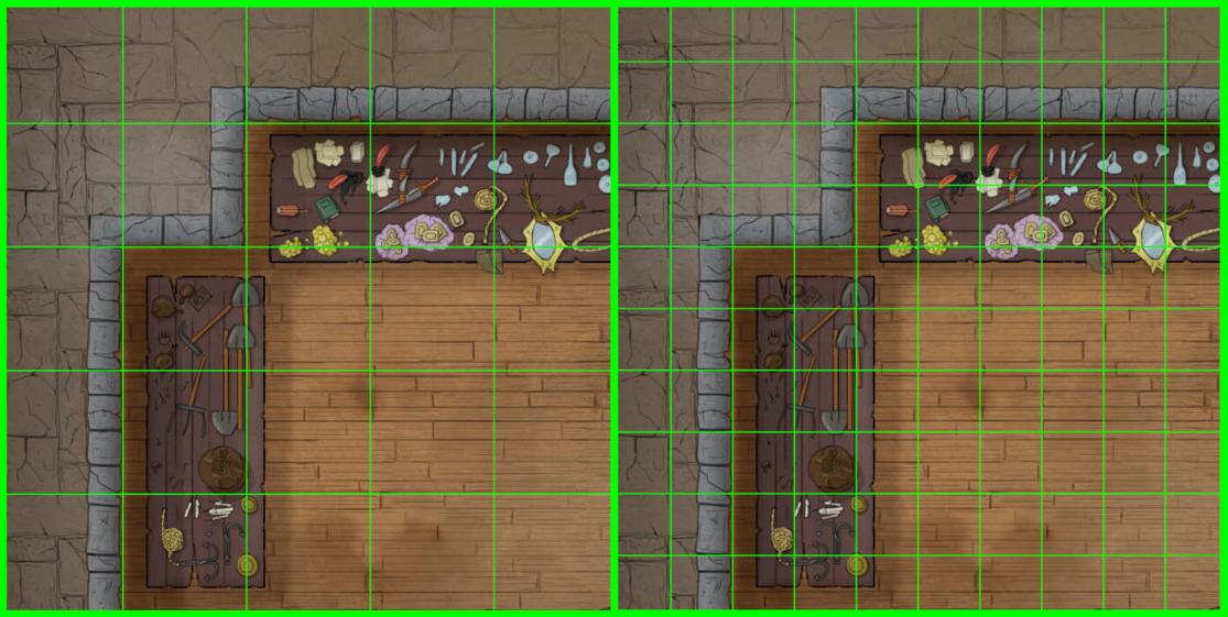
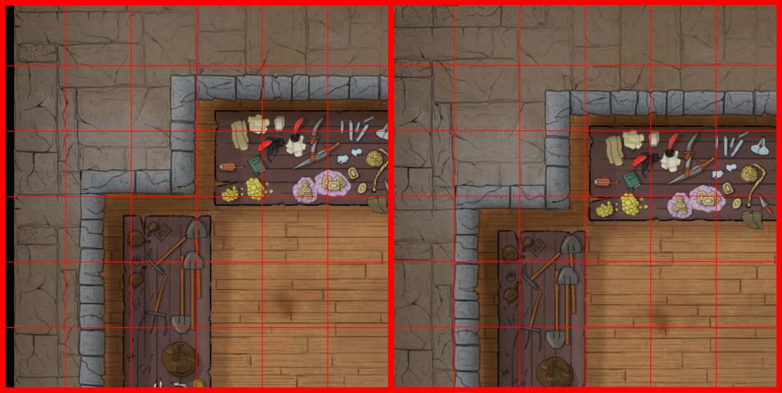
Tile-based scenes should be created with Padding Percentage set to 0, and should have a width and height large enough to incorporate all tiles that the scene would have. This prevents any mishaps with laying tiles outside the rendered lighting area.
Choosing an appealing background color for the scene is important. A jarring, all-white background on a map image that otherwise uses dark colors can negatively impact user experience. Choose your color of background in a way that really showcases your image. Darker background colors are preferred to lighter ones, unless some specific aspect of the scene requires a light background color. When in doubt, #000000 is a good fallback.
While FVTT defaults the scene background color to a neutral grey, setting the background color to #000500 can provide a very nice 'shadow box' emphasis on the background.
Grid Color should either be left at the default #000000, or inverted to #FFFFFF depending if the scene background is very dark.
Grid Opacity defaults to .2, and does not necessarily need to be changed, but can be adjusted to provide the optimal visibility of the grid based on whichever aesthetic you choose. If you modify the default solely for the purposes of making the grid more visible while walling or placing lights, remember to return it to the default .2 before you consider the map finished.
Resolution and Uniformity
Foundry VTT does not reference or use the DPI or PPI of an image. Instead, it takes the quality of an image from the resolution and the number of pixels per grid space. The DPI/PPI of an image is only relevant to FVTT in cases where the map would be printed at 1 inch per grid space.
Images created for use as Foundry VTT scene backgrounds should be generated with a standardized grid in mind, for example, a scene background that is 4000x3000 and intended for use on a 100px square grid should contain 40 columns of grid squares and 30 rows of grid squares.
A pitfall for map creators is the 'non-uniform' grid. The number of squares in your grid should always be a multiple of the map's aspect ratio. If your aspect ratio is 16:9, it should have a width in grid squares that is a multiple of 16, and a height that is a multiple of 9- thus 32x18 would work, or 64x32. A 30x20 map for a 16:9 aspect ratio, however, will not work.
Most modern map editing programs come prepared with grid layouts that take the headache out of this.
When drawing your walls in your map art, it is important to align the walls and doorways to the grid to make lighting and navigation as seamless as possible. There are two factors involved: the scale your art is drawn in, and the scale of the grid in your scene. These must be compatible, otherwise aligning the scene grid to the map art and laying accurate walls becomes difficult or impossible.
Right: A map with art drawn at 140x140 grid scale, but in a scene with a 70px grid scale.
Right: The same map, after attempts to align the walls to the grid, which is impossible.
Grids
Scenes created for use in FVTT must have a minimum grid size of 50px. Grids must be an integer, decimal based grids will not work. Ideally, these grids should be at least 100px to allow for the best snapping of grids when placing objects.
Foundry uses a sub-grid system for placement of walls and lights which provides snap-points for those objects. As the precision of the sub-grid improves based on the size of the grid square, it benefits strongly from larger pixel grids. The subgrid scales in the following ways:
Grid Precision
128px or higher: Snap points every 16th (0.0625) of a square.
64px or higher: Snap points every 8th (0.125) of a square.
50px or higher: Snap points every 4th (0.25) of a square.
Foundry VTT automatically enables Token Vision and Fog of War exploration for newly created scenes, but defaults Global Illumination to off.
Global Illumination should be used in scenarios where the lighting of the scene is so strong that it allows all persons in that scene to see as far as they are physically able. Global illumination should be enabled for outdoor scenes which do not have indoor portions, and should be disabled for indoor scenes. In scenes that are mixed, Global illumination should not be used, and instead a large ambient light source should be provided in the outdoor portions.
Darkness level should be set to 0 for most maps, though for caverns and dungeons, and other places with very low lighting if your map is quite bright adding a darkness level at .3 or .6 can provide a great ambient feel and emphasize light sources for players without obscuring the art. As a rule, if a map was made dark to represent night already, no Darkness Level should be set.
(Optional) Global Illumination Threshold: If your scene is intended to have both indoor and outdoor portions or is expected to transition into night while the players are on it, setting a global illumination threshold will disable global illumination when the Darkness Level of a scene is reached. This is particularly useful if players are walking from outside into a cavern- GMs may press the Transition to Darkness button to cause the scene to grow dark and this function will disable global illumination in passing.
A common question we see is "How much distance should a grid unit/square cover?" The short answer is: the type of map and the game system being used determines this. For example, DnD5e defaults to 1 square being 5 feet for battle maps, and miles for regional maps. When considering distances, it is a good idea to account for the relative sizes of a medium-sized token (1 grid square) to make sure that top-down tokens are scaled appropriately to the surrounding environment. If you need an aspect-ratio to consider, doors and furniture should be sized appropriately to a medium token.
FVTT supports setting a grid square to be whatever distance or measurement you feel to be appropriate, however- keep in mind that in most cases tokens for the map will take up one whole grid square by default. If that grid is set to 10 feet, 3 meters, or 1km, it can break immersion for players whose characters can suddenly attack an enemy well-outside their normal arm's reach.
For scenes containing art representative of much larger spaces, like a town or regional map, it is best to use miles or kilometers if measuring distance, or possible days and hours, if measuring travel time instead. These maps may also benefit from being set as gridless scenes, allowing for more fluid movement between locations.
Walls
For guidance on setting up and using walls, see the Walls article.
The placement of walls and restriction of visibility is a matter that many people have strong opinions on, and wherever possible the Foundry VTT team wants to be sure that we're respecting the intent of a creator when we're providing feedback and recommendations for standardization. However, there are some best practices that can be passed on that will both streamline your efforts at walling and provide some tricks that will leverage Foundry VTT's vision system to emphasize visual aspects of your maps.
General Rules
A good shortcut for handling a large map for walling is to wall everything as a normal wall, rapidly, while holding the ctrl key down. This allows you to place a lot of walls in rapid sequence which can be selected and edited later.
Avoid placing walls while holding the shift key unless absolutely necessary, as it prevents snapping to the scene sub-grid and is the most common cause of light leaking through walls.
Choosing the correct wall type is important for providing the right visual and movement effect. Terrain walls are great for objects you want players to be able to see, but which should block vision past them (such as a statue, boulder, pillar, or the exterior of a building). Directional walls are useful in cases where players should be able to see down from a ledge, but others below that ledge should not be able to see above. Invisible walls should be used for windows, unless the window needs to be immediately traversable, in which case a Secret Door with visibility restrictions set to 'none' is useful. In situations where the view into an area is blocked, but movement is not (such as a hanging curtain, or an illusionary wall), Ethereal walls should be used.
Long Segments
As a rule, it is better to provide long walling segments instead of multiple smaller walls, and in general to use walls as efficiently as possible in your map. While the lighting and vision systems are very powerful they can be overwhelmed to the point that performance is negatively impacted when too many walls are used.
Vision & Movement Blocking
It is a common impulse when first beginning to use walls in FVTT to try and use walls to block vision on every tree, every post, every box or rock. Not everything facet of a map needs to be walled. Placement of walls should be done with a player-focused view. The GM will always be able to see the whole map, but players are limited to seeing only what the walls allow them. Too many walls, while they may offer a more 'realistic' experience, will negatively impact the way players experience the map. When beginning to set your map up with walls, ask yourself these questions:
- Should it block movement or sight or both?
- Is it tactically or logically important to block sight or movement?
- Does it really need to prevent sight or movement at all?
- Does it serve the map's aesthetic or is it better without?
You can save a lot of time, performance, and placement of walls if you just trust that a GM or their players will know that they can't park their token in the middle of a pillar.
As an example: a vision blocking tree in a forest map, while it may seem logical to you, will cause players to see every portion of the map obscured by the tree trunks as a long, dark shadow. Visually this is unappealing, and sometimes makes navigating the scenes more difficult than intended.
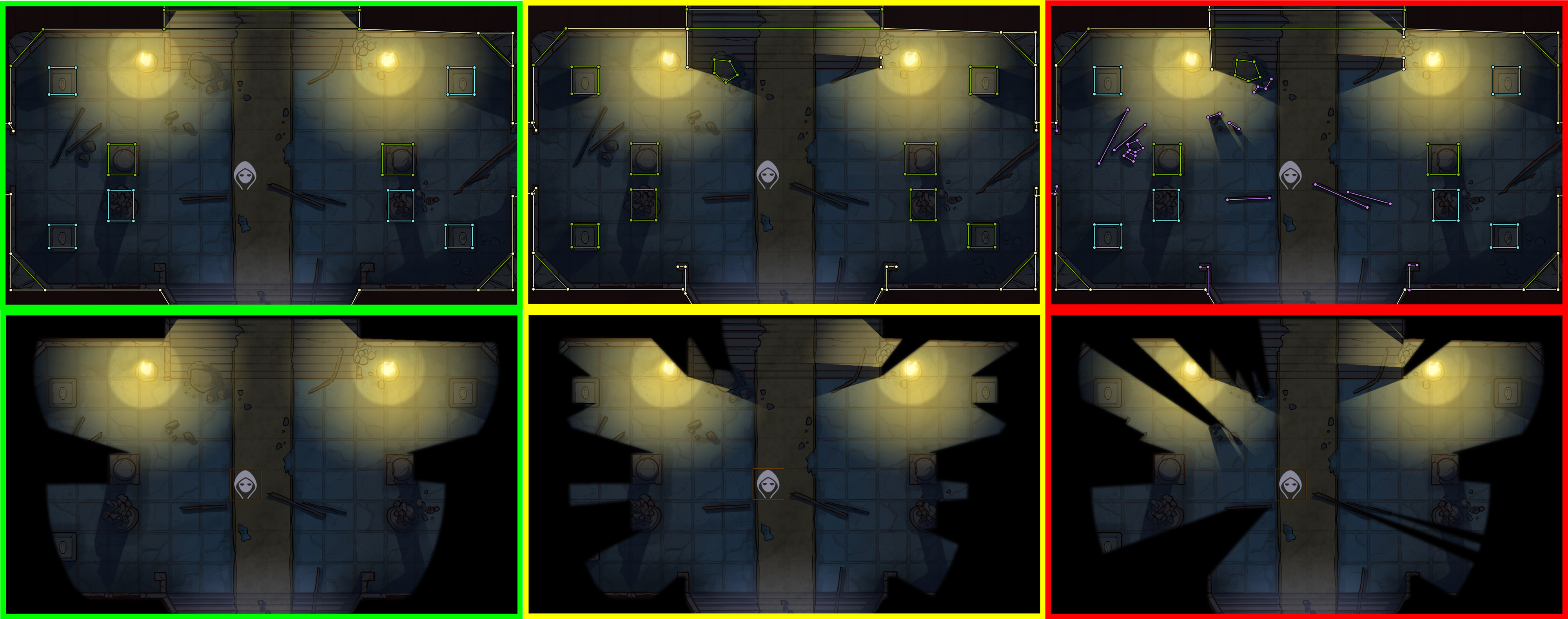
Center: A more complex approach to vision and movement, to tightly limit visibility for players in tactically complex scenes. This should be used only sparingly.
Right: A scene with an excessive amount of vision and movement blocking walls, this creates a cluttered and unpleasant view for players and should be avoided.
Spacing
Remember that tokens need to be able to move through places you are walling. Narrow passages should be walled in a way that still allows a token to move through if they are intended to be passable.
In general, a passage should always be as wide as a single square if you want players to be able to freely move through them. A good way to test your map's navigation is to place a token into the scene, and use arrow keys to move around. Alternatively, log in as a player to test the map from their perspective, since GMs can drag any token through walls, but players can't.
A common trick for creating passable areas that appear narrow or blocked is to wall the movable section as normal, but place ethereal walls to faithfully block vision if the passage is narrow.
Precision
As mentioned in the 'grid' section above, Walls gain better precision from larger grid sizes. Attention to detail and aligning walls can be a challenge, here are some guidelines to follow which will help make it easier:
When walling interiors of buildings, Foundry VTT walls should be placed approximately in the 'center' of a graphical wall. If the graphical wall is not thick enough to allow for that, favor should be given to providing as much visibility of the art as possible.
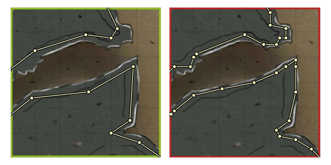
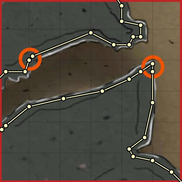
Do not attempt to faithfully wall every small notch on the edges of a natural surface such as a cavern wall. Most of the time, this will only detract from the art, negatively impact performance, and likely not improve the appearance of the scene in a way that players will notice. Generally, a long segment that roughly matches the angle of the wall's shape is sufficient to provide visual blocking without obscuring the map art.
Right: Walls overlap the art, stop navigation, and their segments are small, and numerous.
FVTT favors ensuring that walls stay connected wherever possible, and one of its protections can sometimes leave 'micro-walls' behind. These small segments of wall occur if the mouse moves while you are clicking to place the endpoint of a wall segment, and are most commonly caused by trying to place wall points too quickly while using ctrl+click to chain them. Microwalls should be deleted and the wall segments they previously joined should be dragged to join properly.
Lighting
For guidance on setting up and using lights, see the Lighting article.
Lighting can completely change the way players view a map and elevate already great artwork to a new level. Foundry VTTs light source options can be leveraged in clever and subtle ways in order to provide extra emphasis that can't be achieved with just an image file.
General Rules
Unless it is necessary to account for specific system-related light mechanics for your content, lighting should favour the visual appearance of lighting in a map over trying to adhere to strict mechanical rules on how far light spreads based on a game system. Users are less likely to check a light source to see if the torch matches what their game says it should cast for light than they are to notice that a light source just 'looks wrong'. Aesthetics are more important than mechanics.
Light sources should always be given a color. Foundry's default color for light sources is the same color used to render vision, and as such, tokens which are granted dim or bright sight may miss when a light source of the same color is present.
There are some suggested colors below that can provide some rich overtones, but they are only guidelines, always tweak the light color and intensity to achieve the best visual look for your scenes.
Color Palette
We commonly see questions about what color should be used for lights of certain types. There is no hard set rule on this. The way a light source looks depends heavily on the colors used in making the map, and as in real life, the color of a light source can look different when shining on a red background as opposed to a green one. Below are some very rough guideline example colors that can be used in common cases, but you should always tweak the color and color intensity in order to achieve the best appearance.
(These values all assume a default 0.7 color intensity, adjust as required for your scene.)
- Candles, Torches -
#a2642a - Fire (orange)-
#7f4a14 - Fire (yellow)-
#a2642a - Daylight (warm) -
#b79471 - Daylight (cold) -
#94a6bc - Full Moonlight (warm) -
#ab9c8c - Full Moonlight (cold) -
#647080 - Magical Fire / Neon Red -
#800000 - Magical Fire (Blue) / Neon Blue -
#000080 - Magical Fire (Green) / Neon Green -
#008000 - Magical Fire (Purple) / Black Light (Purple) -
#540080 - Reflective Gold -
#f0be35 - Reflective Water -
#6dcab4 - Magma -
#c27a29
Placement
Lights always look best if they have a logical, visible origins, such as torch sconces, braziers, pools of lava, giant piles of littering gold, or magical documents hovering ominously above a stone dais.
Though players might be hard-pressed to identify disembodied lights as the reason a scene feels strange, people have an inherent ability to notice when lights are coming from nowhere, and unless that's intended, try to avoid it when lighting scenes.
For light sources that are made up of individual lights (such as collections of candles, or a candelabra) it is best to create a single light to represent the total light produced, instead of lighting every single candle. In some cases where there are multiple light sources of varied colors in close proximity, consider using a single Chroma-animated light source instead of individually placed lights.

Right: A two-candle candelabra represented by two overlapping lights.
Animations
Foundry VTT's lighting animations can be used in a number of clever ways to make your maps come to life. The following are some quick tricks that you can use to make your maps really shine.
Glittering gold (Sunburst)
- Bright Light: 0
- Color: #f0be35
- Light Animation Type: Sunburst
- Animation Speed: 1
- Animation Intensity: 2
Mist from active waterfalls (Swirling Fog)
- Bright Light: 0
- Color: #878787
- Color Intensity: .45
- Light Animation Type: Swirling Fog
- Animation Speed: 5
- Animation Intensity: 5
Shimmering water (Ghostly Light)
- Bright Light: 0
- Color: #878787
- Light Animation Type: Ghostly Light
- Animation Speed: 2
- Animation Intensity: 7
Drifting Clouds (Swirling Fog)
- Bright Light: 0
- Color: #878787
- Light Animation Type: Swirling Fog
- Animation Speed: 2
- Animation Intensity: 5
Churning Magma
- Bright Light: 0
- Color: #c27a29
- Light Animation Type: Ghostly Light
- Animation Speed: 2
- Animation Intensity: 7